Posted: Tue May 21, 2013 9:10 pm
Me too, although "imsoboredthatimademorelogos.png" looks pretty good too in my opinion.StinkerSquad01 wrote:I think I'm going to stay firm with #10, however.
A place to discuss all things Wonderland!
https://pcpuzzle.com/forum/
Me too, although "imsoboredthatimademorelogos.png" looks pretty good too in my opinion.StinkerSquad01 wrote:I think I'm going to stay firm with #10, however.
I not sure if I should say "Lol", so I'll use a smiley instead:Nobody wrote:Huh, my entry's not there.
...goodie, less embarrassment!
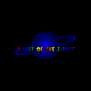
Having looked through the zip file of all the entries, I thought your Logo Project (1) entry was the best of the entire lot, I liked the placement of the words in relation to the graphics, and it was bright and colourful. Shame there were some copyright problems with them. Maybe the grahics could be replaced with something non-copyright?Pawelec wrote:I'm very sad that you didn't decide to use any of my logos with planets Patrick. These were the best ones I sent you, but there were some copyright problems with the graphics I used
I know it is too late now, but I found replacement graphics I made myself in my giant SVG folder. There's no ice planet graphic, but I think I can make it quickly and send a logo that doesn't violate any copyrights in few hours.popo wrote:Having looked through the zip file of all the entries, I thought your Logo Project (1) entry was the best of the entire lot, I liked the placement of the words in relation to the graphics, and it was bright and colourful. Shame there were some copyright problems with them. Maybe the grahics could be replaced with something non-copyright?Pawelec wrote:I'm very sad that you didn't decide to use any of my logos with planets Patrick. These were the best ones I sent you, but there were some copyright problems with the graphics I used
I also realised that when I finished the logo, so I made Project 3 (still too crowded) and finally Project 5 with only one planet and UFO. I remade Project 5 too.StinkerSquad01 wrote:That's cool, but it just seems a little too "busy" to me. In other words, I feel that the amount of graphics is distracting. The graphics themselves are neat, though. I like the use of the reverse-engineered starship.
Or it could just choose a random one on startup out of, say, all of them in a single folder.VirtLands wrote: There were some very nice logos in the zip. It would be a loss to only use 1.
I had the following ideas:
(a) The P.O.T.Z. game could store within itself several favorite logos,
and then it would display a different logo for each detected month.
{ Each month would have a logo dedicated to it. }
or...
(b) The P.O.T.Z. game would download a new logo monthly,
displaying each logo as a surprise tribute.
or...
(c) The P.O.T.Z. game could be self-configurable, to ask each user,
which particular logo to show, and it would stay with 1 logo, till changed.
You would be correct.Technos72 wrote:Yeah, it looks like #16 is the best from all of them. I think I overdone my logo a bit and I think #16 fits the wonderland theme more than it. I don't care if I win, just rooting for that logo. I think it was SS01 who did it?
jdl wrote:But which one would be used as the "Official" logo for the website?
Sounds like a good solution.LittleZbot wrote:Just give the people who made those twelve logos a free copy. Problem solved!
Please say you weren't... I really like the idea.LittleZbot wrote:Kidding.
But Patrick deserves our money for all the awesome stuff he's making, guys.Pawelec wrote:Please say you weren't... I really like the idea.LittleZbot wrote:Kidding.
You're absolutely right.jdl wrote:But Patrick deserves our money for all the awesome stuff he's making, guys.Pawelec wrote:Please say you weren't... I really like the idea.LittleZbot wrote:Kidding.
I actually like the sarcastic idea.Pawelec wrote:You're absolutely right.jdl wrote:But Patrick deserves our money for all the awesome stuff he's making, guys.Pawelec wrote:Please say you weren't... I really like the idea.LittleZbot wrote:Kidding.
On the other hand, people who made nice logos deserve some reward too... <sarcasm> Maybe not a free copy, but maybe some kind of a discount? </sarcasm>